3.1 Module Demo

3.2 Module Configuration
Note:We used the images of module’s installation on Joomla 3.x to illustrate.
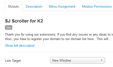
After installing, go to Extensions -> Module Manager and find SJ Scroller for K2to configure.SJ Scroller for K2 module is configured in 6 main groups of parameters as following:
- Module.
- Source Options.
- Items Options.
- Image Options.
- Effect Optionss.
- Advanced.
Let’s look at the parameters in detail:
Module.
- Link Target – Set target for links clicked
- New window
- Same window
- Popup
Source Options.
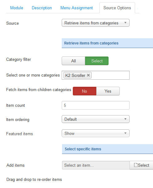
- Source – Choose the source of content that is used with this module.
- Retrieve items from categories
- Category filter – Allow to choose type of Category filter: All/Select.
- Select one or more categories – Allow to select one or more categories for which you want to filter an items list.
- Fetch items from children categories – Allow to fetch items from children categories or Not.
- Item count – Allow to set total of items to be shown by module.
- Item ordering – Allow to choose items show on frontend.
- Featured items – Show/Hide/or show only Featured items display Featured items
- Select specific items
- Add items – Allow to select an item you want

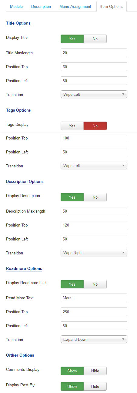
Items Options.
- Title Options
- Display Title – Allow to show/hide title of items.
- Title Maxlength – The maxlength of items’s title. Set “0″ to show full title.
- Position Top – Set position for title.
- Position Left – Set position for title.
- Transition – Set effect for title transition.
- Tags Options
- Tags Display – Show short description OR not.
- Position Top – Set position for description.
- Position Left – Set position for description.
- Transition – Set effect for description transition
- Description Options
- Display Description – Show short description OR not.
- Description Maxlength – Allow to set the length of description, set 0 for unlimited.
- Tags Display – Show tags OR not.
- Position Top – Set position for description.
- Position Left – Set position for description.
- Transition – Set effect for description transition
- Readmore Options
- Display Readmore Link – Show Readmore OR not.
- Readmore Text – Allow to set text instead of “Readmore”.
- Position Top – Set position for description.
- Position Left – Set position for description.
- Transition – Set effect for description transition.
- Orther Options
- Comments Display – Allow to show/hide comments of items.
- Display Post By – Allow to show/hide post by of items.
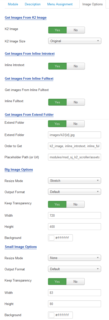
Image Options.
- Get Images From K2 Intro
- K2 Image – Allow to show K2 items image OR not.
- K2 Image Size – Allow to choose size of image: original/Extra Small/Small….
- Get Images From Inline Introtext
- Inline Introtext – Allow to show image inline introtext OR not.
- Get Images From Inline Fulltext
- Inline Fulltext – Allow to show image inline fulltext OR not.
- Get Images From Extend Folder
- Extend Folder – Allow to show/hide Extend Folder.
- Extend Folder – Set path to external image folder used by option above.
- Order to Get – Order to Get image.
- Place holder Path (or Url) – The path or URL of Default Image.
- Big Image Options/Small Image Options
- Resize Mode – Allow to choose the mode of image resizing.
- Output Format – Output Format after resizing.
- Keep Transparency – Allow to keep images transparent, for PNG and GIF format.
- Width – Allow to set width of image.
- Height – Allow to set height of image.
- Background – Allow to set the color of image background.

Effect Options.
- Effect – Allow you to select one from main effects for sliding.
- Auto Play – Allow you to set autoplay for slideshow.
- Pause when Hover – Allow you to set pause being hovered OR not.
- Keyboard Navigation – Allow you to use arrow key for navigation.
- Touch Navigation – Allow you to use touch/slide for navigation.
- Start Slide – Allow you to set first slide.
- Strips – Allow to enter the number strips for strip animations.
- Block Cols – Allow to enter the number of block columns for block animations .
- Block Rows – Allow to enter the number of block rows for block animations.
- Animation Speed – Allow you to set how fast slideshow to slide, larger is slower.
- Interval – Allow you to set time to stop between sliding, larger is slower.
- Navigation Style – Allow you to choose one of 3 styles.
- Direction Navigation – Allow you to show direction for navigation.
- Control Navigation – Allow you to show control for navigation.
- Navigation Tooltip – Allow you to show tooltip for navigation.
- Timer Options
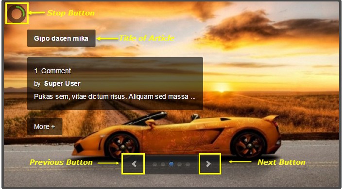
- Display Timer – Allow to show small clock over big image.
- Timer – Allow to choose one of 3 styles for timer.
- Timer Position – Allow to set position for timer.
- Timer Background – Allow to set background for timer.
- Timer Color – Allow to set main color for timer.
- Timer Opacity – Allow to set transparency for timer.
- Timer Diameter – Allow to set how big is timer.
- Timer Padding – Allow to set padding for timer.
- Timer Stroke – Allow to set stroke for timer.
- Timer Bar Stroke – Allow to set bar stroke.
- Timer Bar Stroke Color – Allow to set color for bar stroke.
- Timer Bar Stroke Style – Allow to set style for bar stroke.
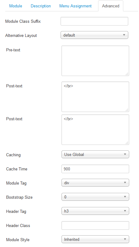
Advanced Options.
- Module Class Suffix – Allow you to choose another CSS class that suits your template
- Alternative Layout – Set custom layout for this module.
- Pre-text – The content to show at the top of module.
- Post-texl – The content to show at the end of module.
- Caching – Select whether to cache the content of this module.
- Cache Time – The time in seconds before the module is recached.
- Module Tag – Allow to select the HTML Tag for module.
- Bootstrap Size – Allow to set the number of columns that module will use.
- Header Tag – Allow to select the HTML Tag for module header/title.
- Header Class – Support the CSS Class for module header/title.
- Module Style – Select module style.
