Implement Responsive Web Design
1. Learn Visitors Using Mobile Behavior
By knowing how visitors access your website using mobile devices and which pages they access the most, you can focus to optimize responsive for these pages and elements.
2. Plan Your Design
You must understand how your website will look then you can easily customize the template and seamlessly integrate it with your brand. Therefore, it is necessary to plan your design layout first. You should create a wireframe then visual your design before coding your web. A mobile design should be awesome.
Some tools to create responsive prototypes (it's better to create several prototypes and test them on various screen sizes):
- Adobe Edge Reflow: It converts Photoshop files into HTML and CSS and allows you to adjust the design using mobile breakpoints.
- InVision: With a link , you can test how your website would look in different contexts.
- Wirefy: It allows you to use a responsive grid and create a wireframe of your site without having to manually calculate widths and percentages.
3. Work more on the Navigation
Navigation is an important part of any website. Good navigation is a useful strategy to boost website design and page visits. In responsive web design, it must be more carefully to work with navigation. The most important menu items must be visible on small screens and using the hamburger menu for the rest of the links. You can also include the links to other pages in the text on the homepage to make the navigation easy.
4. Optimize Images
Image is an important part of a website, it makes the website be more attractive. For a productive site, product's images will allow visitors visualize your products that they're interested in buying. Images must be optimized on small screen sizes, so your website will load quickly on mobile devices.
It is recommended to use jpg for images or photographic, png-8 for icons or logos with transparent background required. You can reduce the image size by using online tools.
5. Mobile First Approach
As mentioned in tip number 2, it is great to have a mobile design for your website. You will have an overlook your website on smaller screens. If it well displays, then your design will adapt the lager screens without any problems.
6. Use Media Queries
Media queries is a CSS3 module that allows content rendering to adapt to conditions such as screen resolution. When using media queries, it will check for the resolution, width, and orientation of the device and display the appropriate set of CSS rules.
For example:
/* On screens that are 992px or less, set the background color to blue */
@media screen and (max-width: 992px) {
body {
background-color: blue;
}
}
7. Use Keyboard Triggers in Forms
You can take your site adapt to the width and size of the screen by making the input fields trigger the correct type of keyboard. For example, the text input like name, email, address should trigger a textual keyboard while the input requires a number should trigger the numerical keyboard.
By taking this improvement, your website will be more user-friendly and elegant for visitors on mobile devices.
8. Easily Clicked Button on Small Form
Do not forgot the button on your website. You can use padding on the buttons to increase the clickable area. You can also follow Material design recommendation for button accessibility and ensure they're 36dp high. (1dp = 1px).
Make sure that they are easy to recognize:
- Use color to distinguish them from other elements.
- Use a rectangle or a circle to for the button.
9. Optimize Typography
To make sure that the text on your website is legible on smaller screens, let optimize the typography. The good size for your body copy is 16px or 1em and then adjust the size of your headings accordingly. If you want to adjust the line height of your text to 1.5em, please ensure your paragraph lines have enough breathing room.
Another tip for mobile website design is to use a legible font. Avoid decorative or script fonts for body copy or in your menu items because they're hard to read, especially on smaller screens.
10. Use Microinteractions
The direction UX design is moving is in the details, and that means more attention on Microinteractions. While they may not seem highly visible or important, but they make huge impacts on the user’s mood and opinion. Microinteractions are also useful on mobile devices as well.
Examples:
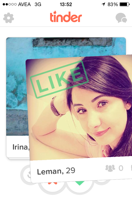
- Swiping Actions: Tinder - This interface choice is about as good as it gets — simple and easy to understand, fun, quick, and original.

Source: Tinder
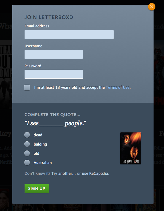
- Themed Captcha: Letterboxd - Letterboxd illustrates a good point with their captchas from famous movie quotes. The clever microinteraction transforms an otherwise annoying task into a task that feels a little more fun.

Source: Letterboxd
11. Adopt Frameworks
By adding a responsive framework to your workflow, you can save a lot of time on designing a responsive website. If you want to design simple, static websites, HTML framework like Bootstrap is nice to start.
You can also take advantages of pre-made responsive Joomla templates if you want to make a more complex website and incorporate a blog into your marketing strategy.
12. Stick to Minimalist Design
Minimalist Design eliminates all the clutter, makes it easier for visitors to focus on your content thus improving conversion rates, and helps your website load faster because it uses fewer elements.
13. Share Buttons Aren’t Blocking Your Content
Share buttons will bring more traffic for your website, however, they may block your content and make it hard to read on small screens. So, you should make sure that the share buttons scale nicely on smaller screens by testing them on a mobile device.
Check If Your Website Is Responsive
After finishing all these tips, lets check if your website is responsive or not.
1. Mobile Friendly Test by Google: Just enter your website's URL and click Analyze. You will see the result soon.
2. Test with real mobile devices: there is nothing better than using real mobile devices to test how your website will look on small screens.
Source: https://business.tutsplus.com/


